Trusting Strangers … A Lesson from Photographs
October 14, 2015
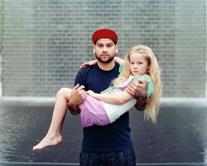
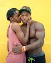
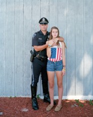
Richard Renaldi, Touching Strangers series, 2007-present
I’m looking backward again. While in Chicago last summer I visited Richard Renaldi’s “Touching Strangers” exhibition at the Loyola University Museum of Art. This series has gotten a lot of attention and I’m still mulling it over.

Renaldi
On the surface, the idea is an easy one: Renaldi asks people who have never met to pose in an intimate way—as if they are a couple, family, or close friends—and then he takes a photograph.
Okay … but there are a lot of (mostly unanswered) questions here. How did he approach them? When the participants are in a private space—like a hotel room—how did he get them there? How did he pick them? What did he say when he first approached them? Did they decide how to touch or was there some coaching? If so, how much?

Renaldi
After a little digging, I did find a answers to the last couple questions. Apparently, Renaldi did make suggestions to the participants—like to flirt or even kiss. This makes sense if you’re a photographer wanting interesting photographs. It makes less sense if you want to really explore the connection between touch and relationship, which was the series’ ostensible reason d’etre.
In fact, after looking at the first half-dozen photographs in the gallery that day in June, I found the basic interpretation of the project to be all wrong. I had read that Renaldi is using touch to make spontaneous and fleeting relationships between strangers. I don’t think so. He’s just asking them to touch, and touching does not necessarily mean a relationship has formed, even a fleeting one.
Renaldi
This demands a little interrogation. For some photos, you could say that the subjects performed relationship because they got into it and acted like they were in a relationship. Or, you could say that the relationship he created was “two people who participated in this artist’s project.” And maybe for a few of the photographs, the brief interaction did lead to a real connection between of the participants. But as a whole, these photographs are not about relationships in any meaningful sense of the term.
Now, despite this criticism, I think this project is fascinating—just not for the reason Renaldi and others have proposed.
Renaldi
As I walked around the gallery, I was struck again and again by how the subjects dealt with the issue of trust. To participate, they had to trust each other and they had to trust Renaldi—and all the more so because they were directed to pose in intimate ways. To shake a hand is one thing, to kiss or even hug is quite another.

Renaldi
For me, each photograph became a study about how different people react when this kind of trust is requested or even demanded of them. For some, they throw themselves at it, as if the best way to trust is to pretend there’s nothing at risk. For others, they tense up and exert their will over any fears. Others seem to be comfortable with the scenario—as if they have a natural trust in people, even strangers.
Maybe this has struck home because I have young children and the idea of “stranger danger” is everywhere. My mama bear instincts flash when someone I don’t know even talks to my children, let alone touches them. And yet, I don’t want my children to grow up always keeping strangers at arm’s-length. I want them to reach out. I want them to practice hospitality.
There are so many passages in the Bible that stress the importance of hospitality—welcoming strangers, into one’s home, trusting them in order to give them a place for refuge or rest. One of my favorites comes from Hebrews: “Do not neglect to show hospitality to strangers, for by this some have entertained angels without knowing it” (13:2).
With the refugee crisis growing around the world right now, we can see the relationship between trust and hospitality playing out. There are millions of strangers who desperately need a place of rest and refuge. Do we have the trust to reach out and welcome them? Where is our trust?
Of course, our trust is in God. God calls us to open our doors, to kindle a fire, to prepare a meal… to touch a stranger as if she is family, as if he is an intimate friend.
And when we reach out, we place our trust in God.
I just wish it were that easy.
Casting Stones
September 30, 2015

Julie Green, Last Supper, 2000-present
After a long hiatus for a whole mess of reasons, I’m returning to the discipline of looking and praying and writing. I never stopped looking, but it’s time to get back to the praying and writing. I need it.
 Julie Green’s Last Supper has been on my mind since I saw it at the Block Museum of Art at Northwestern University this summer. The project, I think, is brilliant. In a nutshell, she has painted about 500 (and counting) individual plates to show the meal requests of death row inmates. She includes the state where the execution occurred and the date. Sometimes, when there was no last meal, she has text simply describing situation–a denied request or no request at all, for example.
To stand in a room full of these plates—there were 357 in the exhibition I saw—is haunting. I felt the presence of these individuals. I knew approximately three things about them, but that was enough to make each one a distinct individual. There is something oddly intimate about knowing what someone wanted for their very last meal.
 Bagels and coffee. Three eggs, three slices of bacon, three sausages and toast. Fried chicken and watermelon. Grilled fish, oysters, and prawns. Four eggs, four chicken drumsticks, salsa, four jalapeno peppers, lettuce, tortillas, hash browns, garlic bread, two pork chops, white and yellow grated cheese, sliced onions and tomatoes, a pitcher of milk and a vanilla milkshake. A pack of cigarettes.
Green helps us to think about the humanity of these individuals. By showing us something about them that is so basically human, she deters our tendency to view these individuals as “the evil other,” and instead gives us something in common with them. What would you request?
 Green’s choices underscore her message. Because she uses second-hand plates—and each one unique—the plates feel so personal. As objects, they had previous lives in which they held other meals for other people, and now they carry their own last meals as well. At the same time, there is something monumental and unified about the plates because there are so many of them, and all painted in a brushy style with cobalt blue. There is, after all, one thing that unites all the different lives these plates represent.
What makes this particularly brilliant, at least to my mind, is how Green subtly draws a connection between these individuals and Jesus. The title “Last Supper” is not simply a play on a well-established subject matter in art, she uses it to make bigger claims (or ask bigger questions).
After all—Christ, too, was executed. He also had a last meal.
In this, her project takes on a slightly different angle. Can justice ever be fair, true, and impartial? In Jesus’ case, clearly not. Jesus was tried on trumped-up charges and condemned by a judge who was clearly manipulated by a powerful interest group. And our own justice system? How many of these death sentences have been the result of similar circumstances? How can we ever know?
A student who was with me in the exhibition pointed out that Green’s approach completely elides the facts about the crimes these prisoners committed and that, if we knew the charges, our feelings of connection and maybe even sympathy would likely be significantly diminished. I agree.
What Green does, however, is level the field—to emphasize our common humanity—in order to question our right to judge and condemn to death. Even if they have committed heinous crimes and “deserve to die,” do we have the right to kill them? Jesus said it: “You who are without sin cast the first stone.”
The would-be executioners that Jesus confronted that day knew they needed to put down their stones. Do we?


A Testimony of Grace
April 27, 2015

Keith Haring, Altar Piece, 1990
(this edition is in Grace Cathedral, San Francisco)
While in Denver for a short trip a couple weeks ago, I spent a few hours at the Denver Art Museum. They have this artwork displayed in a rather odd place—a wide corridor that connects their two main buildings. You could easily miss it, except it’s a Keith Haring, and Keith Haring tends to draw attention.
Haring made nine editions of this cast-bronze sculpture shortly before his death in 1990. A firsthand account of its making, written by Sam Havadtoy, has become the primary way that this artwork is popularly understood. If you’re curious, you can find it here.
Obviously, there is lots of Christian iconography here.
The viewer is immediately drawn to the baby in the middle of the center panel, presumably an infant Jesus in the arms of Mary. But the figure that extends up is also vaguely trinitarian–the many arms suggesting the omnipotence of God. The topmost pair echo the arms of the cross, and the head seems to look down. The short lines surrounding this figure convey a sense of energy.
On the left and right panels, Haring drew four winged creatures. Havadtoy described them as an image of a fallen angel (the Fall) and the resurrection (Christ’s victory). The people crowded below seem to dance, swoon, and reach up to heaven.
So, as far as I can tell, this is usually interpreted as a reflection on—if not an affirmation of—the sacred. I get that. Haring does express Christian theology about salvation in a rather tidy and compelling image.
But, there’s another way to read this—as a personal reflection on his own impending death.
When he drew so-called “radiant babies” before, he was connoting a range of things—sometimes Jesus, but also all of humanity and even himself. The main figure–an all-powerful, loving, tender God– cradles this little baby. Could Haring have imagined himself being held by God as he prepared for his own death? Could he have been contemplating how, despite his own sin, eternal life might be possible because of God’s love for him?
I don’t know. After a protestant upbringing and an affiliation with the Jesus Movement, he spent much of his short adult life being skeptical about religion and the church. He did come back around to Christianity, apparently, so it’s conceivable that he would do such an overtly theological artwork—especially when drawing on a triptych shaped like an altarpiece—but it is less clear if he would have endeavored a personal reflection on his own salvation.
But does it really matter? Haring understood how language and symbolism work. An author/artist uses a series of words/symbols to send a message, but the receiver might hear/read a different message because they understand the words and symbols differently. Ambiguity is part of the game of communication.
So, he carves these symbols into clay and they are cast into bronze. The message is sent.
I am satisfied.
Lent … Look Up!
March 23, 2015

Lucas Cranach the Elder, Weimar Altarpiece, 1553-55
(The City Church of Saints Peter and Paul, Weimar, Germany)
I feel the need for a big dose of theology today. Lucas Cranach the Elder will do it. In fact, where do we start?
This painting could be a visual treatise on the doctrine of salvation—with a Reformation emphasis on salvation by grace for all who believe. Very simply, John the Baptist (the third man from the right) points up to the crucified Christ to indicate that one only needs to look up to Christ to be saved. That’s grace. This simple message is repeated and expanded throughout the rest of the image.
 In the background, for example, the scene with all the tents shows the story from the Old Testament (Numbers 21) when God’s people spoke against God and he rebuked them by sending poisonous snakes. Moses called out to God on their behalf and God told him to make a bronze snake and put it on a pole so anyone who was bitten could look up to it and live. He did and they were. In other words, they could be saved by merely looking up to the symbol of God’s power and grace. It’s an Old Testament prefiguration of the crucifixion—when Christ is put up on a pole and people are saved by looking to him. Here, that connection is made obvious because both John the Baptist and Moses point up—LOOK UP and LIVE!
Others look up in the background. Right beside all the tents is the scene from the gospel of Luke when an angel appeared to the shepherds after Jesus was born and told them, “Today … a Savior has been born to you!” Instead of announcing the Messiah’s birth to religious folk who would seem to be the most deserving, God chose to tell those who would appear to be the least deserving of all. Grace again.
Back to the foreground, John the Baptist not only gestures up, but also points downward to the sheep. This references the gospel story when John saw Jesus coming and declared, “Behold, the Lamb of God, who takes away the sins of the world!” It’s an astonishing thing to claim. When sin became a prominent aspect of human nature (it didn’t take long), God instituted a religious practice that included sacrificing animals to acknowledge one’s wrong-doing and “cover it,” at least temporarily. Because sin is perpetual, the sacrifices were too. But John seemed to know immediately that Jesus would become an ultimate sacrifice—just like the animals, he would die, but this sacrifice would be complete, permanent, and inclusive. In Christian theology, one only has to accept his sacrifice in order for it to be the ultimate sacrifice. Thus, LOOK UP and be forgiven … be saved.
 Cranach seems to want to emphasis that we are saved by grace and not by simply being good, for he tucks a counter example behind the cross. There we see a nearly naked man, who symbolizes humanity, being chased into hell (the flames) by Satan (the monstrous figure) and Death (the skeleton). He’s destined to burn not because he’s been bad, exactly, but because he has tried so hard to live by the law (here upheld by members of the clergy and Moses himself). The point: If you seek salvation by being a good person, it just ain’t gonna work because no matter how hard you try, you’re going to screw up, which, according to the law, means death. Try to live by the law, you’re going to die by the law.
The alternative? Look up to Christ. If you do, you will not only be saved from eternal damnation, but you will witness victory over sin and death. That’s the resurrected Christ on the left trampling Death and Sin. Needless to say, you want to be on his side.
Up to this point, the bits of iconography are pretty standard. But then we get to the two men on the right.
 The one on the outside is none other than Martin Luther. He points to an open book which has three biblical passages from his own German translation of the Bible—I John 1:7b, Hebrews 4:16, and John 3:14-15)—which point to the various themes of the painting and underscore the main point. Believe that Christ’s sacrifice saves you and it will.
The man with the white beard is Lucas Cranach the Elder himself. Apparently, the painting was finished by Lucas Cranach the Younger, so I’m not sure if this should be considered a self-portrait or a commemorative portrait. Either way, the important thing is the stream of blood that gushes from Jesus’ side and splashes on top of Cranach’s head. While somewhat gruesome, Cranach testifies here that he has allowed the blood of Christ to “cleanse him from all sin” (I John 1:7). His faith has saved him.
Interesting … he doesn’t actually look up to Christ, even though that seems to be such an important message in this painting. Instead, he looks out at us directly. Making eye contact, it is almost as if he is pleading with the viewer to take all of this seriously, maybe even follow his example. Look up, believe, and be saved.
I’m Protestant by habit, so the churches I’ve gone to don’t have crucifixes, they have empty crosses. I was told that this (a) prevents us from idolatry (no praying to a craved god, even if it is Jesus) and (b) allows us to celebrate the empty cross, the risen Christ. Okay, fine. But I am a little jealous of my Catholic friends who can practice looking up to the crucified Christ every time they go to church. That seems important.
Maybe I’ll head over to Saint Al’s this week.
Lent … A Battle Scene
February 23, 2015

Pieter Brueghel the Elder, The Battle between Carnival and Lent, c. 1559 (Kunsthistorisches Museum, Vienna)
This week we marked the passage into the holy season of Lent. I used to make much of Ash Wednesday and the beginning of Lent, but I haven’t had ashes on my forehead for years now. It’s complicated. Which is why this painting came to mind.
This is a typical Brueghel painting in that it is crammed full of stuff. Your eye wonders around a bit until you finally hone in on the action at the bottom center. Two characters are riding make-shift contraptions toward each other, both carrying “lances” as if they are about to joust. The one on the left (riding a beer barrel) symbolizes Carnival—the season that runs up to the beginning of Lent and is characterized by indulgence, especially in the areas of food and drink. The character on the right (being pulled on a cart) symbolizes Lent—the period leading up to Easter during which Christians practice abstinence as a way to remember Christ’s sacrifice and prepare for the holiest of Holy-Days.
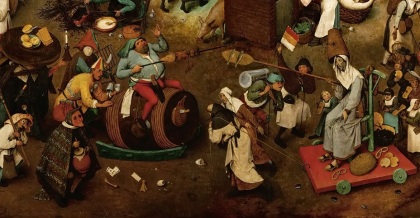
The two figures personify the two seasons in many ways. One is well-fed; the other is lean. One fights with skewer full of meat, the other with board of fish. For helmets, one has a meat pie, the other a bee hive. One is followed by a table of bread and waffles (the starch of Carnival), while the other brings pretzels and biscuits (the starch of Lent). The contrast extends beyond the two figures. The people on the left crowd into taverns, parade around in masks, and imbibe; the people on the right, many having crosses imposed on their foreheads, prepare themselves for Lent, including giving alms to the poor and disabled.
Scholars have offered varying interpretations of this painting. For some it’s a straightforward picture of the perennial triumph of Lent. Others point to the historical context and suggest that the painting is an allegory for the religious tensions between Catholics (for whom Lent was a deeply held tradition) and Protestants (who had abolished Lent, but still observed Carnival). Still other scholars point to the ridiculousness of both sides of the battle and argue that Brueghel is commenting about just how superficial all these religious practices have become—it’s all a show.
Looking at it today, and from a personal perspective, I wonder if this reflects a conflict that many of us feel. We know we should be engaged in the practices long associated with Lent—abstinence, generosity, penitence, contemplation. Those are all very good and worthy things. But it’s complicated.
It’s convenient to suggest that Brueghel may be commenting about the superficiality of all religious practices. It lets us off the hook—just like when we (okay, I) dismiss another’s practice just because he announces that he can’t have the chocolate cake because he gave sweets up for Lent. Such displays of piety have a tendency to make me want to steer clear of acts of piety altogether. Thus, to arrive at this kind of interpretation of the painting makes me suspicious. Interpretations can reveal a lot about the interpreter, after all.
This doesn’t mean I’m going to run out to find a pastor who will put ashes on my forehead ex post facto, but I am going to commit to thinking differently about these Lenten traditions that (frankly) have seemed at times to be more show than soul-shaping. My motives will never be pure and a little alms-giving, and a little abstinence will likely do my spirit good.
(And now I’m wondering if this whole blog entry is a show of piety. Ha. Of course it is.)
Stitching It
October 18, 2014
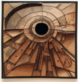
Lee Bontecou, Untitled, 1960
(Art Institute of Chicago)

David Wojnarowicz, image from video “A Fire in My Belly,” 1986-87
(Fales Library, NYU)
Whenever I come across any one of these artworks, the other two spring to mind. I have no idea if the artists knew of each others’ work (possible, for two of them) or were referencing each others’ work (doubt it), but nonetheless they are tied together, so to speak.
All three artists stitch–into canvas, into dead skin, into living flesh–and the act of stitching seems to be integral to the meaning of the work. Wojnarowicz’s is perhaps the most gruesome–it is his own mouth he closes with yarn–but Salcedo’s is almost as visceral, perhaps because she’s using skin. Comparatively, Bontecou’s seems merely suggestive, but I can’t help seeing flesh and sinew.
But this isn’t like sewing or embroidery or cross-stitch. These stitches evoke sutures, as if a wound is being closed.
Doris Salcedo, Atribiliarios, 1992

Detail of Salcedo’s work
Salcedo is dealing with wounds–the cultural wounds inflicted by La Violencia in her native Columbia. People were disappeared–here one day, gone the next, with only traces left behind of their existence. These shoes carry, hold, transport the memories of the people that once wore them, and are here buried in the walls, stitched behind pigskin. In a very self-conscious way, she is opening the very wound she closes.
In this way, Salcedo echoes Wojnarowicz, whose stitches do not close a wound at all, but call attention to a culture of silencing that leads to deep psychological pain. He uses his own flesh to locate the hermeutical injustice felt by victims of AIDS in the 1980s. It is not ironic that he had to stitch his mouth closed to finally be heard.

Detail of Bontecou’s work
Operating between and around the other two, Bontecou uses wire to attach recycled canvas to a welded steel frame. The works evoke both machine and flesh, growth and deterioration, cutting and mending. The opening, which is sewn shut in Wojnarowicz’s video, gapes and yawns here. Like with Salcedo’s work, I find myself stepping closer, peering in, wondering what’s in there. Nothing. Black nothingness.
It strikes me that Wojnarowicz is using a slightly different visual idiom–the other two directly reference stitches or sutures, but he sews. Plus, the work is a video, so we see him making the stitches, sewing his mouth shut with blood running down his face. He doesn’t flinch.
Bontecou doesn’t flinch either, in the more metaphorical sense of the word. She does not seem to be referencing either pain or silencing as much as the monstrous. Perhaps it’s because I just finished reading Mary Shelleys’ Frankenstein, but these human-made creatures seem to reach off the wall to swallow me whole.
It is the visual, visceral connection between these artworks that amplifies the power of each. I leave feeling heavy, saddened, burdened. There are so many wounds in this world.
Advent is right around the corner. Come, Jesus, come. And quick.
Yellow Christ
September 22, 2014

Paul Gauguin, Yellow Christ, 1889 (Albright-Knox Gallery)
Back to some religious subject matter. I tend to treat Gauguin with a little skepticism, but I like this painting—perhaps because it’s just a good painting (visually speaking), perhaps because it strikes a chord.
First, the visual. Gauguin puts the cross off-center, so that it’s anchored to the top and left edges, giving the painting a strong structure. Yet, because we don’t see where it connects to the ground, the cross seems to hang rather than stand. Three women kneel on the ground in a semicircle that connects (through line and color) to the rock wall that snakes across the middleground and leads back to the village (also bluish).
Because the body of Christ is the brightest yellow in the painting, it not only draws our attention, but it is linked to the landscape—and the rolling fields more so than the trees—and sets him apart from the women.
The subject is ahistorical, of course. The setting is Brittany, in France, in the late 19th century. In that context, these pious women would be kneeling in prayer before a crucifix, but this crucifix holds a figure of Christ that seems more real than sculpted or painted.
One explanation suggests that Gauguin painted a spiritual experience–these women are so devout that they are being given a vision of Jesus as he hung on the cross. They look down in the painting because Gauguin wanted to convey that this is a powerful interior experience. The vivid contrasting color and the rather thick outline of Christ’s body not only emphasizes that he is distinct from them (and their muted blues), but also gives the viewer a potentially powerful visual experience of the crucified Christ.
The experience of these women–as Gauguin paints it–is enviable. I hear about people who have visions or other types of intense spiritual experiences and I think, Must be nice. They receive assurances, they have personal encounters with Jesus, they get regular reminders of God’s grace! But then I remember that a life characterized by mystical experiences is probably the result of a deep and abiding faith. Right.
In an earlier phase of life, I think you would have found me in the middle of that group of women, trying (though not very successfully) to cultivate a practice of contemplative prayer.
Now, I more often feel like the man climbing over the wall. I have no idea why Gauguin put him there, but when I see him, I see someone making a break for it. But why? Is he freaked out by their religiosity? Does he have something seemingly more important to do? Is he afraid of engaging in that kind of spiritual practice? Has he just had enough?
I can’t answer the question for me either, but it could be any of those reasons. I’m glad that Gauguin put him in there because it’s probably good for me to reflect on such things. I’ll do that. And maybe I’ll wander back to the circle.
Racism … America Is Bleeding
September 1, 2014

Faith Ringgold,
The Flag Is Bleeding, 1967
(Collection of the Artist)
The events in Ferguson, Missouri, have disturbed me deeply. I am saddened by yet another death under circumstances that have become too familiar and chilled by how authorities handled the first minutes, hours, and days. And then … I have been so dismayed by people saying that this isn’t about race. How is this NOT about race?
I’m pretty sure that anyone who thinks that we don’t have a race problem in the U.S. does not have an African American friend, because if you do, you have heard stories about how he or she has been profiled, dismissed, insulted, and discriminated against (if you haven’t, I suspect that your friend is shielding you). It happens all the time, at every income level, in every city in America. It’s systemic.
Anyway … a number of artworks have been coming to mind, like this painting by Faith Ringgold.
It shows a black man, a white woman, and a white man linking arms, as if standing in solidarity. They stand behind the U.S. flag–even intertwined with it–so that it feels like their group identity is tied to a national identity. Or, conversely, this is what America looks like–male and female, black and white, all together.
But, of course, the painting is not that optimistic. What seems, at first, like a patriotic gesture on the part of the black man is more than that. He’s covering a wound that is bleeding profusely. If we follow the big drips of blood down, we notice that he’s holding a knife.
Honestly, this painting has confounded me. Has he wounded himself? Or is it actually a wound on the flag? Either way, why does he seem to be the one who first caused the wound and now tries to staunch the flow of blood? Why do the other two figures seem so nonchalant?
I don’t have any good answers.
But what I do see is a bleeding flag. The symbol of the United States is wounded and is losing the very thing that sustains it. Something is very wrong. That much is clear, even if you can’t quite determine what that wrong is exactly.
That’s the way I feel about race relations in the United States. Something is clearly wrong. Even as people from various racial and ethnic backgrounds walk together in solidarity, as they did in Ferguson, there is still division, still loss of life, still deep wounds in the fabric of our society.
The flag is bleeding.
God help us.
(Pause)
God help ME.
Notes from Japan …. Interiors
August 26, 2013

I’m not in Japan, actually, but part of me is still there. That is, when I close my eyes I can still feel what it’s like to be in a traditional Japanese interior space. Quiet and calm.
The photo above feels a little staged, but it conveys some of the basics of these rooms. Wood frame, a few bare walls, lots of moveable screens, and tatami mat floors. There may be a low table, but all the other furniture and stuff is tucked away in storage closets, to bring out only when you need it. The only decoration may be a painting and/or a flower arrangement in an alcove.
The aesthetic is very simple and clean. Lines are straight. Materials are natural. Spaces are open. The light is diffuse and warm.
There is a serenity about these rooms that makes me breathe deeper, sit up straighter, move more slowly. I came to believe that there’s something about being so close to the floor. It’s as if my center of gravity is lower (which, I guess, it is), and thus I start to feel more rooted, more stable.
I hope to carry this with me for a while. Maybe even in the midst of a crazy American lifestyle, I can still retreat to one of these spaces in my imagination every once in a while. And there, I can breathe and sit and listen and be.
Notes from Japan … Hokusai
August 4, 2013

Hokusai, Thirty-Six Views of Mount Fuji, 1829-32 (Hokusai Museum, Obuse, Japan)
It’s been awhile… But it’s Sunday, so it seems like a good day to do some reflecting again.
I recently had the good fortune to visit the Hokusai Museum in Obuse, Japan. It’s a wonderful little museum, principally because it has on display all Thirty-Six Views of Mount Fuji (actually 46 color prints) as well as the 100 Views of Mount Fuji he published in book form (actually 102, but who’s counting). It’s amazing to see them all together.
What struck me was the concept behind this project. Mount Fuji is clearly the focus, and we see it from scores of different angles and distances–from prefectures  and villages to the north, south, east and west, from a few kilometers away to hundreds, and a few “views” as if we are standing on the mountain itself. Consequently, sometimes the mountain is huge and imposing, practically filling the frame, and other times it is tiny, tucked between other closer mountains, under the crest of a wave, or behind a cloud.
But … it’s always there. And that’s the point. Mount Fuji is always there.
 To underscore this point, Hokusai included all sorts of activities in the prints. People fish, repair a roof, cultivate a field, make a barrel, walk against the wind, carry loads, celebrate, shop. Sometimes there are no people and we see more timeless glimpses of nature—a spider’s web, a group of cranes, a dramatic wave, mist rolling in.

As I moved from image to image, my first impulse (of course) was to find Fuji in each one. Even if it’s diminutive in the composition, viewers who are aware of the theme tend to focus on the mountain first and then peruse the rest of the scene. But what I noticed was my own response. With each print, I seemed to breathe a little deeper—even now, actually. There was something about the mountain’s presence on the landscape that centers me.
I suppose it makes sense that people have associated gods with mountains. If you live close to them, they dominate one’s view and even one’s life. They seem strong, untamed, lordly. God-like. This could (and has!) lead to fearing the mountain, but my own response is different. I take comfort in that omnipresent mass that serves as a backdrop for daily tasks and big events and even natural rhythms of life.
 I imagine the people in Hokusai’s prints glancing over to Fuji and giving a little bow as they go about their business, completely aware of its presence, its importance, its power. My own life is so full of duties and chores and tasks, but perhaps I can manage a little bow of my own to my Maker, Sustainer, and Lord.
