The Chi-Rho … Decorating the Sacred Word
October 14, 2013
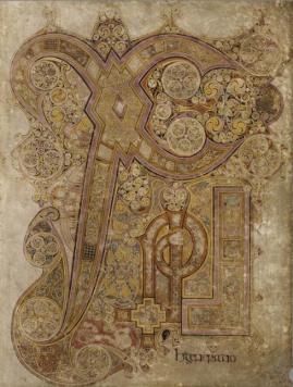
Chi Rho page, 34r, Book of Kells, c. 800
(Trinity College, Dublin)
Click the image to go to a digital facsimile of the book and scroll down to folio/page 34 to see a much better image.
This is the Chi Rho page of the Book of Kells, a early 9th-century book that was lavishly decorated by monks somewhere in modern-day Ireland. It’s probably one of the most famous pages of any book ever, and it’s no surprise why.
It gets its name from the Greek letters that appear rather prominently: X-P-I (pronounced Chi-Rho-Iota), which are the first letters of the sacred name, “Christ.” The page appears in the book at the moment when Jesus is first called “the Christ” in the gospels, which significant because he’s being identified as more than just a prophet or rabbi. He’s the Messiah. Other manuscripts from this time and place have Chi-Rho pictures, but this page is far-and-away more spectacular than any other.
Visually, the page is stunning because everything seems animated (it’s no wonder that it inspired the 2009 animated film, “The Secret of Kells”). The letters seem to draw themselves, with the arching lines of the Chi, the Rho which curls in on itself, and the Iota that sprouts at its top. Small circles spin inside bigger circles and they appear to move like yo-yos along the bold outlines of the letters. The rest of the interlacing (or weaved patterning) seems to weave itself into knots. The only shape that seems still is the cross form toward the bottom—the bold yellow and black lines are strong and definitive, as if the design of the whole page started and stopped right there. Ah, yes, indeed.
This is where I could get all heady and pick apart some of the iconography. Suzanne Lewis wrote an article years ago that explained it in a way that still gives me chills.* I’ll simply say that there are three bits of imagery—cats and mice, an otter and a fish, and two butterflies and a chrysalis—which all point to Christ as the Eucharistic host. They emphasize that, with the Incarnation, God was made flesh and it is that flesh that we consume—metaphorically, at the very least—when we celebrate the Eucharist. In the theological narrative, what connects the Incarnation with Salvation is, of course, the crucifixion. The cross. The Chi. Perfect, no? Chills?
All that appeals to my mind, but it is still the visual power of the page that makes my soul hum. Monks decorated the books they copied not because they had extra time on their hands, but because they were passionate about the uniqueness of the words these books contain and they conveyed that belief by painting the pages with extravagant designs. This was the Word of God, and the Word of God is dynamic, powerful, extraordinary. These intricate illuminations never let readers forget that this was no ordinary text.
That seems so right to me. At some point along the line—perhaps around the time of the first publication of the Good News Bible—we shifted from treating Bibles as intensely special books to emphasizing the Bible is common and accessible to all. Not a bad shift, to be sure! But I do think we lost something. We lost the mystery, the holiness, the wonder.
No doubt I’ve lost it too … except when I look at a book like this. Then, the page, the letters, and the text itself seem so shockingly alive, it feels like I’m looking at something powerful and mysterious. It’s the Word of God, and don’t you forget it.
*Suzanne Lewis, “Sacred Calligraphy: The Chi Rho Page in the Book of Kells,” Traditio 36 (1980), pp. 139-59
