Seeing Grace
May 13, 2018

This detail comes from a painting by Frederick Hardy called Try This Pair. It’s a quirky genre painting of a door-to-door eye-glasses salesman. While he offers different pairs to an older gentleman who is testing them with a newspaper, this boy has clearly snitched a pair off the table to try on himself. His expression suggests that he has just discovered what the world really looks like.
I distinctly remember the first time I got glasses as a teenager. Exiting the shore, I looked out over the parking lot and then to the mountains beyond, and I couldn’t believe how clear everything was. Edges were sharp! Trees had leaves! My prescription was slight, but oh what a difference it made.
This post from way back in January came to mind because I’ve been going to an adult forum series on how we experience God and are thus transformed through our senses. I firmly believe that our five senses are avenues for God’s grace. The smell of dinner when I walk through the front door is God’s grace. The sound of birds in the springtime is God’s grace. The sight of blossoming trees and blooming flowers is God’s grace. These things are not earned or deserved, they are gracious gifts.
The forum on Sundays has reminded me of how important it is to pay attention. Be present. Stop and breathe in the smell … listen to the sound … look at what I’m seeing. Really look.
The expression on the boy’s face says it all.
My eyes have gotten worse lately. I should go to the optometrist.
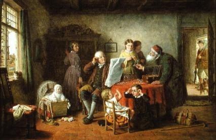
F. D. Hardy, Try This Pair, 1864 (Guildhall Art Gallery, London)
Stitching It
October 18, 2014
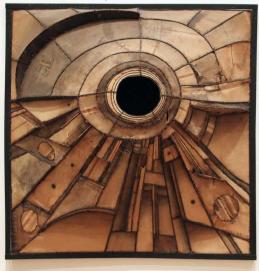
Lee Bontecou, Untitled, 1960
(Art Institute of Chicago)

David Wojnarowicz, image from video “A Fire in My Belly,” 1986-87
(Fales Library, NYU)
Whenever I come across any one of these artworks, the other two spring to mind. I have no idea if the artists knew of each others’ work (possible, for two of them) or were referencing each others’ work (doubt it), but nonetheless they are tied together, so to speak.
All three artists stitch–into canvas, into dead skin, into living flesh–and the act of stitching seems to be integral to the meaning of the work. Wojnarowicz’s is perhaps the most gruesome–it is his own mouth he closes with yarn–but Salcedo’s is almost as visceral, perhaps because she’s using skin. Comparatively, Bontecou’s seems merely suggestive, but I can’t help seeing flesh and sinew.
But this isn’t like sewing or embroidery or cross-stitch. These stitches evoke sutures, as if a wound is being closed.
Doris Salcedo, Atribiliarios, 1992

Detail of Salcedo’s work
Salcedo is dealing with wounds–the cultural wounds inflicted by La Violencia in her native Columbia. People were disappeared–here one day, gone the next, with only traces left behind of their existence. These shoes carry, hold, transport the memories of the people that once wore them, and are here buried in the walls, stitched behind pigskin. In a very self-conscious way, she is opening the very wound she closes.
In this way, Salcedo echoes Wojnarowicz, whose stitches do not close a wound at all, but call attention to a culture of silencing that leads to deep psychological pain. He uses his own flesh to locate the hermeutical injustice felt by victims of AIDS in the 1980s. It is not ironic that he had to stitch his mouth closed to finally be heard.

Detail of Bontecou’s work
Operating between and around the other two, Bontecou uses wire to attach recycled canvas to a welded steel frame. The works evoke both machine and flesh, growth and deterioration, cutting and mending. The opening, which is sewn shut in Wojnarowicz’s video, gapes and yawns here. Like with Salcedo’s work, I find myself stepping closer, peering in, wondering what’s in there. Nothing. Black nothingness.
It strikes me that Wojnarowicz is using a slightly different visual idiom–the other two directly reference stitches or sutures, but he sews. Plus, the work is a video, so we see him making the stitches, sewing his mouth shut with blood running down his face. He doesn’t flinch.
Bontecou doesn’t flinch either, in the more metaphorical sense of the word. She does not seem to be referencing either pain or silencing as much as the monstrous. Perhaps it’s because I just finished reading Mary Shelleys’ Frankenstein, but these human-made creatures seem to reach off the wall to swallow me whole.
It is the visual, visceral connection between these artworks that amplifies the power of each. I leave feeling heavy, saddened, burdened. There are so many wounds in this world.
Advent is right around the corner. Come, Jesus, come. And quick.
A Disaster on Your Coffee Table? Really?
April 7, 2014

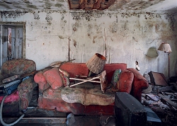
Robert Polidori,
After the Flood, 2005
This week, I’ve been working on a conference paper about coffee table books that focus on natural disasters like Hurricane Katrina and Superstorm Sandy. I understand coffee table books about Glacier National Park or temples of Japan, but disasters? And there are dozens of them.
The ones that are particularly confounding are the ones that are beautiful. The photographs are beautiful, the layout is beautiful, the printing is beautiful. Take this photograph. It shows a bedroom of a house in New Orleans after the floodwaters have receded. The contents of the room have collapsed or shifted and there’s a layer of grime coating every surface. Even the walls above the waterline have blossomed with mold.
It’s a mess, but it’s a beautiful mess. A soft even light fills the room (thanks to Polidori’s exceptionally long exposure times) and the dirt dulls and harmonizes the colors. Polidori also sets up the composition to create balance (the books on the shelf counterweights the doorway and window) and rhythm (the vertical lines of bedposts and doorframe against the horizontals of the footboard, watermark, and ceiling. This is just one of hundreds of similar photographs collected in Polidori’s book, After the Flood.
Critics are quick to point out that this kind of aestheticization of disaster is exploitative. Here is a photographer who is using people’s ruined lives to make gorgeous images for a beautiful book. The counter-argument, of course, is that the beauty of his images is getting people to look at these ruined lives—people who might otherwise have turned away in disgust.
Aside from the ethics of it, I’m interested in the effects of aestheticization. It puts a filter on the content of image. As a viewer, you may feel like you are getting an unmediated view of the destruction wrought by the storm and flood, but you are really getting something you could not actually see if you were actually standing in the room. For starters, there would not be enough light to actually see everything you see here. Furthermore, because Polidori so subtly incorporates harmony and softness, the content is considerably less jarring—less off-putting—than it would be if you were there. Plus, you’re not wearing an air filtration mask, are you?
Robert Polidori,
After the Flood, 2005
I believe that the beauty of this coffee table book distances viewers from the actual places, instead of actually bringing them closer. (If you’re into theory, I’m borrowing from Guy Debord here.) If you think about it, any photograph removes us from direct experience, but when a photographer uses a particularly aesthetic approach, it further separates the viewer from the reality that is depicted. Reality is mediated. You’re looking at something through those proverbial rose-colored glasses.
The problem here …
When these disasters are thus mediated for viewers, they (we) don’t actually experience them, or experience their actuality. We are removed. Sure, we may feel sad or astounded or sympathetic (I certainly do!), but those responses are fleeting. Close the book, and we soon forget.
And that’s the irony, the books claim to have been produced so that people would not forget, but I think they may actually facilitate forgetfulness by supplying pages and pages of images that encourage and then satiate our curiosity. We eagerly consume and, by the end, we are emotionally tired. We’re spent. We close the book. And that is all.
This Ain’t Ansel Adams
March 3, 2014
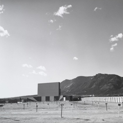
Robert Adams, Outdoor Theater and Cheyenne Mountain, 1968 (Fraenkel Gallery)
I just finished teaching a unit on landscape photography. Like my students, I don’t find landscapes to be intrinsically interesting—it doesn’t matter how majestic the scene or how dynamic the photograph. Until, that is, we get to the 1970s. Then we get to landscapes like this.
Robert Adams is particularly compelling to me, and not just because he took lots of photos in Colorado Springs where I grew up (I swear, for example, that I went to a movie at THAT drive-in sometime in high school). No, I am really intrigued by the questions his photographs seem to ask.
Take this one.
The photograph has three parts: the dirt, the sky, and the band between them. He includes a LOT of sky, with tuffs of clouds that add texture but also pull that part of the photo forward. The dirt has texture too, of course, and poles that draw the viewer into the image (if not into the actual space in the photo).
Adams situates his camera so that the top edge of the screen intersects the contour of the mountain just as the range descends sharply, so the screen’s sharp edge becomes the horizon until it again intersects the gradual incline of the earth on the left. The continuity of the resulting band is enhanced by the similar gray values across the whole width. Only the dark vertical line on the right edge of the screen offers a firm break between nature’s spectacle and a human-made one.
Which I think is the point. The Colorado front range is a spectacle. From any window on the west side of my childhood home, I could watch the mountains change throughout the day. On almost every afternoon in the spring a little drama would unfold as a weather front moved through, bringing huge dark clouds, lightening, and sheets of rain. Even without weather, the movement of the sun would change the appearance and the feel of those mountains.
I did watch. But not often. Certainly not often enough.
I think too often I was caught up in other things to pay attention. Too busy watching human-made spectacles, perhaps.
In photos like this, Adams was documenting the new topography that humans had created. It is easy to read some criticism about how humans have ruined nature, but I think this photo could also point to the fact that it is often precisely because of human insertions into the landscape that we actually notice the beauty of the land. Just look at me right now. I’m not sure I would have given a photograph of Cheyenne Mountain a second look without the screen, the fence, and the speaker poles.
Looking at this photo, I’m feeling nostalgic and regretful. I don’t have a panoramic view of the Colorado Rockies anymore. Oh, to be able to tell my 16-year-old self sitting at that kitchen table to slow down, look out, and just watch.
I can’t do that, but I can try to pay attention now–in the not-quite-as-spectacular landscape where I live now. I can tell my 42-year-old self to slow down, look out, and watch.
Lent … Crossing the Barrier
April 8, 2012

Messina, Christ Crucified, 1475
(National Gallery, London)
I remember the first time I saw this panel at the National Gallery in London almost twenty years ago. It’s a tiny painting, and it still draws me in with its stillness, quietness.
It shows the crucifixion, of course, but without all the usual trappings. There are no guards, no thieves, no crowds. It’s clear that none of that is important to the artist. This is not a history painting of an event as much as a theological meditation on the death of Christ.
The artist Messina has defined two separate worlds here by dividing the painting in half vertically. The lower half, which largely consists of warm tones, is the physical realm. It is occupied by hills and towns and everyday life. The upper half, in which Christ is suspended in an expanse of cool blue sky, is the spiritual realm. It may lie beyond our immediate apprehension, yet it is very real.
Jesus is situated rather high on a cross to completely separate him from the earthly world. He seems small and weightless, and there is little to show of the suffering he has endured, except for the wound in his side and the curl of his fingers around the nails. This is some time after his death, but he does not seem dead. Instead, it looks like he might be gazing down into that physical realm.
The two figures below are Mary (probably the mother of Jesus, but it’s unclear) and John the Younger. They sit on the ground, which ties them more physically to the earthly world. Mary seems lost in thought, but John gazes up with an open palm as if asking some big questions.
By making these two realms remarkably distinct, I think the artist is emphasizing just how difficult it is for us to understand the things of God. John looks up, wanting to understand, but we get the impression that simply he can’t access that information. Even now, from the perspective of two thousand years and with the wisdom of many scholars, the paradox of the death of God still baffles. I don’t think our human minds can really understand.
But Messina consoles us. Remember, Christ seems to look down from the cross. I imagine (and it may be just me) that he wants to say something—maybe a word of comfort, maybe a word of explanation—something to bridge the divide between the spiritual reality and the earthly reality. Can we hear his words? Maybe, maybe not.
But what does bridge the gap is the cross itself. It cuts across the horizontal line with a bold and definitive horizontal band that is then firmly rooted in the soil of the earthly realm.
Honestly, I’m not sure what to make of this. It would be easy to conclude that the crucifixion was the ultimate divine act that broke the barrier between God and humanity. Of course. But, while that may be, I believe that no one can truly grasp the fullness of that truth, and so the spiritual realm should feel just as distant and inaccessible as ever. And there’s the paradox. Thankfully, it’s possible to live in that paradox. And I do this Easter Eve.
Second Sunday in Advent … Oh, Holy Light
December 5, 2011

Rembrandt or Follower, Adoration of the Shepherds, 1646 (National Gallery, London)
One of my favorite images of the Nativity is this little painting. It’s simple, yet profound.
It shows a group of shepherds gathering around the Holy Family. I love the realism here—the stable is so dark with two big cows pushed to the back and a hay loft overhead. And I love that the entourage of shepherds includes not only men, but women, children, and a friendly dog as well. It seems like the event has created quite a buzz. Two of the women lean in with a baby tucked under an arm, sharing a word, while two men kneel to adore the precious baby. One seems humbled and absorbed, the other completely amazed by what he sees. And, no wonder, right?
Notice the light sources in the painting. There’s one low and in the back of the barn—probably a lantern, just like the one being held by the man in the middle that emits a soft light barely strong enough to cast shadows on the floor.
The brightest light in the room, of course, is baby Jesus himself. He’s not just reflecting light, he’s beaming. The light that shines from his body is what illumines the faces of all those hovering over him. No wonder the shepherd looks so amazed. This baby is glowing!
The metaphor is obvious. Jesus is the Light of the World. He has come into this dark, dark world to be a light—the light of God. And that light shines for all humanity—not just the religious, or the powerful, or the righteous, but even for a bunch of ragtag shepherds, their wives, and their kids, even for you and me.
This is a good reminder for me. I feel so aware of the darkness of the world right now. I feel troubled, cynical, hopeless. But Jesus is still the light of the world. Can I let him be the light that pierces the darkness? Frankly, I don’t even know what that means, but I wonder if—just maybe—somehow—I can turn to the Light like these shepherd-folk and find hope again. Maybe.
Thanksgiving … A Fleeting Feast
November 21, 2011

Abraham van Beyeren, Banquet Still Life, c. 1653-55 (Seattle Art Museum)
Thanksgiving makes me think of the amazing Dutch still lifes of the 17th century for all the obvious reasons. Rarely do we have tables that are literally overflowing with such rich and magnificent food.
 Take this one by van Beyeren. It has succulent fruits—peaches, oranges, grapes, lemon, and even a pomegranate that has been broken open to reveal its gem-like seeds. Then there are oysters and shrimp and what I think is another kind of seafood in the porcelain bowl in the center. On the left, is a roasted fowl—duck, goose, turkey?—and a loaf of crusty bread that someone has already torn into (it would have been me). And, no meal would be complete without the wine. The table linens and serving dishes are all the finest. This is a special feast.
Back in the day, paintings like this were a way for the painter to show of his skill. In one single painting, he had to paint a whole range of textures and materials—from the dusty skin of freshly picked grapes and fuzzy skin of peaches to the greasy surface of the roasted meat and gooey-ness of the oyster. But the painting would also serve to suggest the wealth of the family who had it hanging in their home—as if to say that these delicacies are often found on their table.
 But these people were good Calvinists, so such ostentatious shows of skill and wealth were a wee bit problematic. In the minds of these Protestants, one should be careful not to trust in the things of the world for they will soon pass away. So, the paintings were laced with subtle hints that this abundance is fleeting—the lemon is peeled, the bread broken, the peach cut, the oysters shelled. Now exposed to the air, these tasty morsels will soon dry out and begin to rot. If that weren’t enough, the ornate nautilus cup has been overturned, hinting that its precious contents could be lost quick as a wink. Finally, to drive the point home, van Beyeren has placed a watch with an eye-catching blue satin ribbon front and center to remind the viewer that the passing of time is the only constant here. Everything else will die, decay, and disintegrate—even the viewer herself—but time will always be.
It’s not exactly a happy thought as we approach Thanksgiving, but I think that is what Thanksgiving is all about. When we thank God for the many blessings in our lives, our thankfulness can be all the more profound if we acknowledge how fragile and ephemeral these blessings actually are. And, perhaps, we may be encouraged to reflect on the blessings that are as constant as time itself.
